Category:
Industrial + Brand Study
Guide:
Smith Macwan and Manas Barve
Duration:
1 wk (2024)

CMF Sound Pro
Brand Identity
CMF by Nothing is a brand rooted in functional clarity, bold simplicity, and a strong design-first presence. With a visual identity built on clean geometry, utilitarian detailing, and expressive color blocking, CMF creates everyday tech accessories that are both affordable and statement-worthy. This project explores how those values can be translated into a portable speaker using form, color, and materiality to echo CMF’s unique design language.

Brand Analysis
CMF’s brand identity is rooted in expressive utility — where simplicity meets intentional detailing. Visually, it thrives on bold color blocking, tactile contrast, and soft geometric forms. Its product language emphasizes modularity and adaptability, often showcasing swappable parts and customizable accents. Materials are typically matte, with soft-touch surfaces or textured grids that invite interaction. Whether it’s a dial, button, or case corner, every detail is designed to be seen, touched, and felt. The identity is minimal but never sterile infused with energy through punchy oranges, deep navy tones, and subtle grey-blacks that reflect both affordability and sharp design clarity.


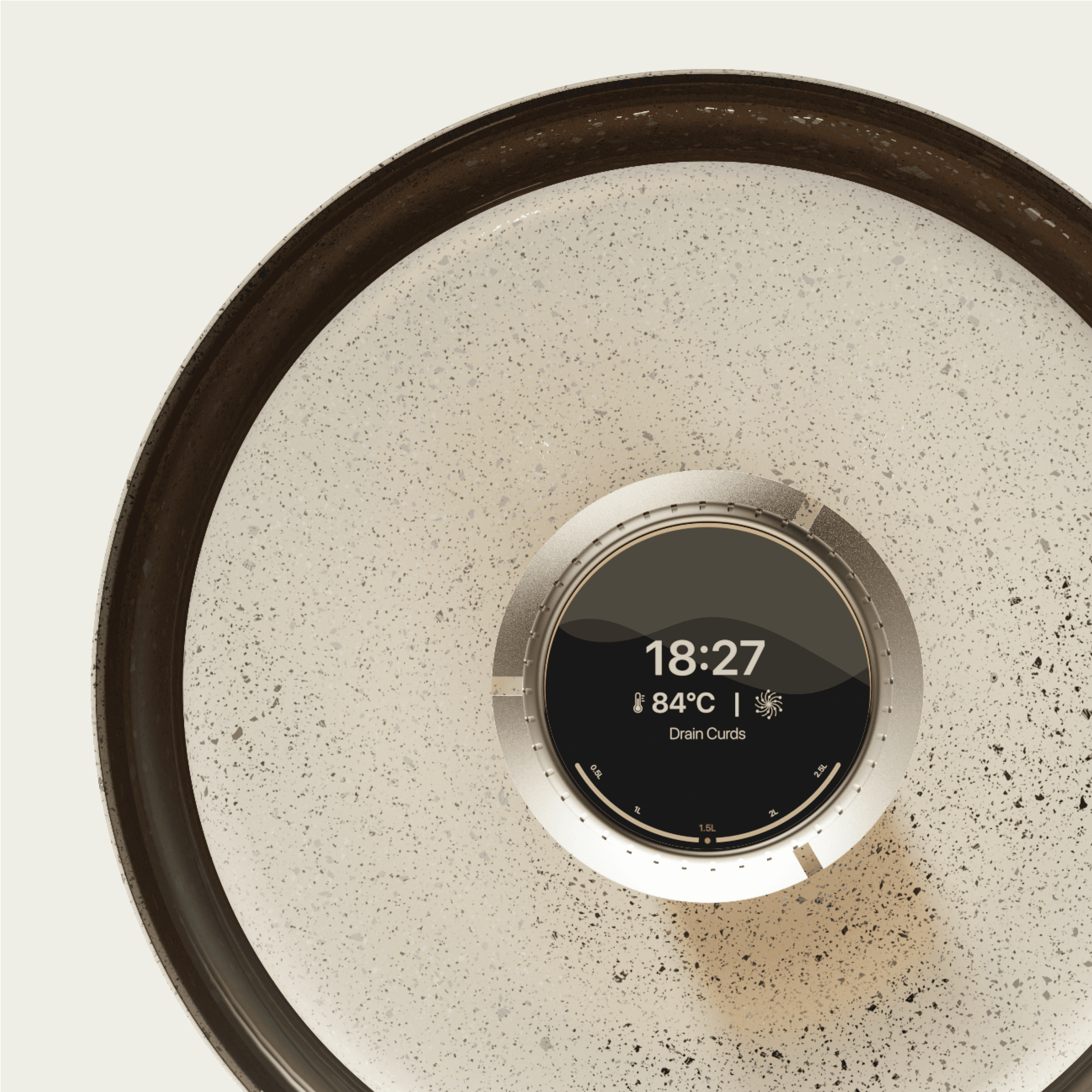
Speaker Pro.
Speaker Pro reflects CMF’s modular philosophy through components tailored to different user needs. A swappable control pack offers two variants — one with tactile buttons for users who are constantly on the move, and another with a sleek touch interface and hidden display suited for home and workspace setups enhancing the visual elegance of the setup.
A detachable battery pack supports long-term usability, acknowledging that batteries often degrade first while the rest of the product remains functional — making the speaker both adaptable and built to last.